You have just invested a bunch of money to become a sponsor for an event. Great! You just received an email asking for a vector EPS version of your company logo. While larger organizations have the luxury of having a marketing department that can process these requests, what do you do when you are the “marketing department”?
You want to ensure that you receive value for your sponsorship, so submitting a proper logo is crucial. Have you ever looked at a program or sign at an event and noticed one or more of the sponsors logos was blurry/pixelated? Don’t let that happen to you. In this blog I will explain how to make sure you submit the proper logo and explain the differences.
Image Types and Formats
This is the part where it gets confusing. There are more different image file types than there are coffee choices at Starbucks. When it comes to logos, the two most common file types will be .jpg and .eps.
Image Formats
• JPG – A raster based image format. The most common image format.
• EPS – Encapsulated PostScript, A vector based image format
Image Types
• Raster Graphics – An image type that makes use of pixels to create graphics. You cannot increase the size of a raster image without a loss in quality.
• Vector Graphics – graphics that make use of polygons to represent images in computer graphics. This allows vector files to be resized to any size without any loss of quality.
Other Terms
• Pixel – A dot of colour, multiple pixels make images.
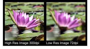
• Resolution – Resolution usually measured in dpi (dots per inch) refers to how many pixels/dots there are in an image. Web based graphics are generally 72dpi. Print graphics are generally 300dpi.
Web v.s. Print
 The biggest difference between web and print graphics is the difference in resolution. A print graphic is 300dpi and a web graphic is 72dpi. This means if you have a print graphic that measures 1 inch, it has 300 dots, where a web graphic would only be 72 dots.
You can’t just make your logo bigger. If your logo is 100 pixels wide by 50 pixels tall and you need it double the size, there will be more pixels to fill, but no information to fill the spots. What programs duplicate existing pixels to fill the space. This leads to distortion, aka pixelated look.
This is the reason eps files are asked for all the time, one file can be used to make a small logo on a program, or a 30 foot wide banner.
The most common reason for the ‘blurry logo’ is using a web version of their logo on printed materials. This mostly happens because a web version is the only version the client has access to, and they are unaware that while a logo can look great on screen it won’t necessarily print well.
The simple solution
There is one easy way to make sure you will always have a high quality logo for anything you publish. Just make sure you have a variety of EPS logos on file that you can send to suppliers eg, colour, black, horizontal/vertical versions if applicable. If you don’t have one, you should be able to get one from whoever made your business cards or stationary.
Finally, here are a few dos and don’ts when sending logo files.
Do
• EPS files are preferred
• High Resolution JPGs are often a good alternative
• Keep your logos on file ready to send
• Have variations of your logo
Don’t
• Save a logo from your website and send it
• Change a file extension from .jpg to .eps (It won’t make it vector, I wish it would)
• If your jpg logo is under 50kb it’s probably not a high resolution logo.
• Try to make a raster image larger
