A name badge seems simple at first glance; it’s just a piece of paper with a name on it. But on that piece of paper is many hours’ worth of consideration, effort, trial and error done by a meeting planner. A name badge helps direct attendees, make registration simpler and assist attendees in interacting with one another. Below are tips to help save you time and make a great name badge for your attendees.
What’s In a Name Badge?
In its most simplified form, all you really need on a name badge is the attendees’ names. The badges are there to assist in identification, attendee networking and to assist exhibitors with their interactions, so a large part of the name badge must be dedicated to the name.
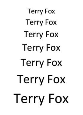
Consider printing out a page containing a name in your chosen font and color at different sizes, pin it to the wall and walk towards it, see which is the smallest size you can read from a few feet away and choose this or the next size up to use on your badges.

Additional Name Badge Information
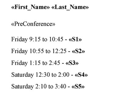
You may have additional information that you want added to a name badge such as company name, breakout sessions or group numbers for discussion groups. If it’s just one line of information you may want to add it to the front of the badge, but many people overlook using the back of the badge for additional information. It may be useful for an attendee to have a list of the sessions they’ve registered to attend on the back of their badge; just let them know it’s there when they pick the badge up.

If you have access to previous badges you may find that they have a format that your client prefers. Don’t be afraid to make suggestions on how to improve the layout, but keep in mind that you will most likely want to keep the same information on the badge year to year.
Exhibitor and Sponsor Name Badge
It’s possible that your event has sponsors and/or exhibitors that will also need a name badge, I would recommend creating a similar name badge but with an obvious way to identify that they are an exhibitor or sponsor. There are many ways to do this, but a simple way is with a different colour scheme. If all your attendees have a solid blue bar at the bottom of the badge containing their company name, a sponsor with a red bar instantly stands out and you and your clients can easily identify them.


You may want to use the company’s colours or colours from the registration website. There are many sites such as imagecolourpicker.com that can help you find the exact code you need to copy a colour from a picture or logo. You will also want to make sure that any colours you choose won’t clash with the logos or images that are already on the badge.
Alternatively if you are short on time or don’t have the necessary space on the name badge there are companies, such as PC Nametag, who can make customized adhesive ribbons or pre-printed badge holders to convey the information.
Name Badge Details
If you’re creating a simple name badge it might only include the event logo, but you may want to think about using a larger background image to foil against the text. Whether big or small the quality of the image is important, try to avoid images with low resolution where possible. If you have multiple smaller images you are trying to incorporate such as sponsor logos, try to keep them at the edges so they don’t break up the important attendee information on the badge.
You may want to created several versions of the layout, especially if you have multiple images to work with or have made massive changes. You can then bring those options to others for feedback, but try to limit it to two or three versions with distinct differences. Again – try taping your mock-ups to the wall to see how legible they are from a distance.
Name Badge Test Run
You have a final version of the name badge that you are happy with and you think you’re ready to print. But before you start adding in your attendee data, make sure to print a test page. Put the test page behind your perforated sheet, hold it up to the light and make sure none of your images or information is too close to the edge. For the best results you will want to try and leave a 0.25” gap around the badge to ensure that nothing gets cut off.
Now you have a fantastic name badge template ready to go – and that’s one more item to cross off the master planning list for your smoothly run and well executed event.
